
Ark Group Construction
Building with clarity.
ARK Group Construction is a South Florida residential contractor building custom homes, duplexes, and additions across Miami-Dade and Broward.
Built around an open-book, cost-plus-fixed-fee model, ARK takes a different approach to construction: clients see the actual cost of the work, every subcontractor bid, every material invoice, and every draw, while the contractor fee stays fixed from the beginning.
We partnered with ARK to redefine how that philosophy could look and feel, creating a new visual identity, digital experience, and photography direction designed to make construction feel as clear and considered as the company behind it.
Visual Identity · Web Design · Art Direction · Photography
The Challenge.
Construction is an industry built around complexity.
Plans, permits, budgets, subcontractors, timelines, inspections, materials, and thousands of decisions all come together inside one project. For the homeowner or investor, understanding what is happening — and what everything actually costs — can often feel just as complicated.
ARK had built its business around doing things differently.
Its open-book model gives clients visibility into the actual cost of construction, while a fixed contractor fee removes the uncertainty of a traditional markup structure. The value was already there. The opportunity was to build a brand that could communicate it.
The challenge was creating an identity that felt credible enough for construction, refined enough for the homes ARK builds, and clear enough to make a complicated process feel approachable.
Our Approach.
From the beginning, one idea guided the work: clarity through structure.
Construction is ultimately about taking many individual elements and bringing them together into something cohesive. We translated that same thinking into ARK’s identity, creating a system built around structure, proportion, restraint, and confidence.
The ARK mark was developed as a strong architectural symbol, giving the brand a recognizable visual anchor that could move naturally from a construction site to a proposal, from a vehicle to a website.
We paired it with a restrained typographic and color system and an editorial approach to imagery, creating a visual language that feels contemporary without losing the authority expected from a residential contractor.
The result is a brand that doesn’t need to over-explain itself.
It simply feels organized, intentional, and built to last.
The Identity.
The identity was designed to feel less like a traditional construction company and more like a brand rooted in architecture.
The shield-like ARK symbol creates a strong, recognizable silhouette while referencing structure, protection, and the built environment.
A deep navy anchors the system, giving the brand a sense of permanence and confidence, while the typography remains clean and restrained to let the architecture and photography take the lead.
The identity was designed as a complete system rather than a standalone logo, giving ARK the flexibility to show up consistently across every stage of the construction experience.
The ARK System.
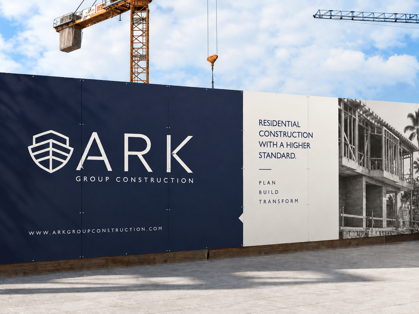
The brand needed to work everywhere the company does.
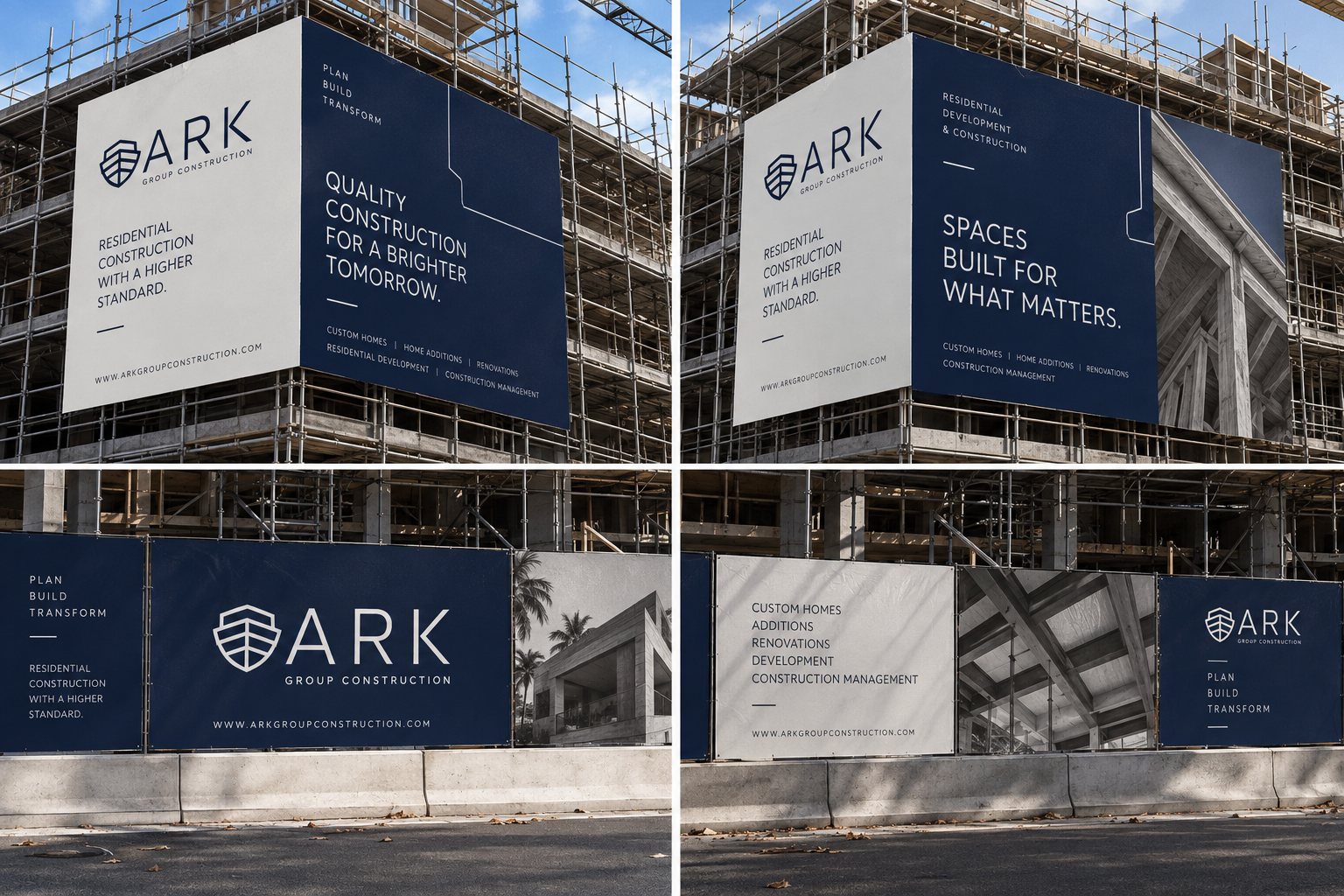
On a construction fence.
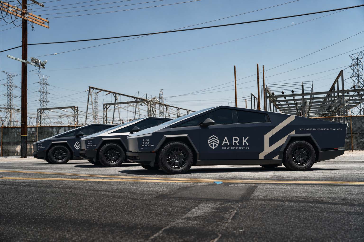
On a truck.
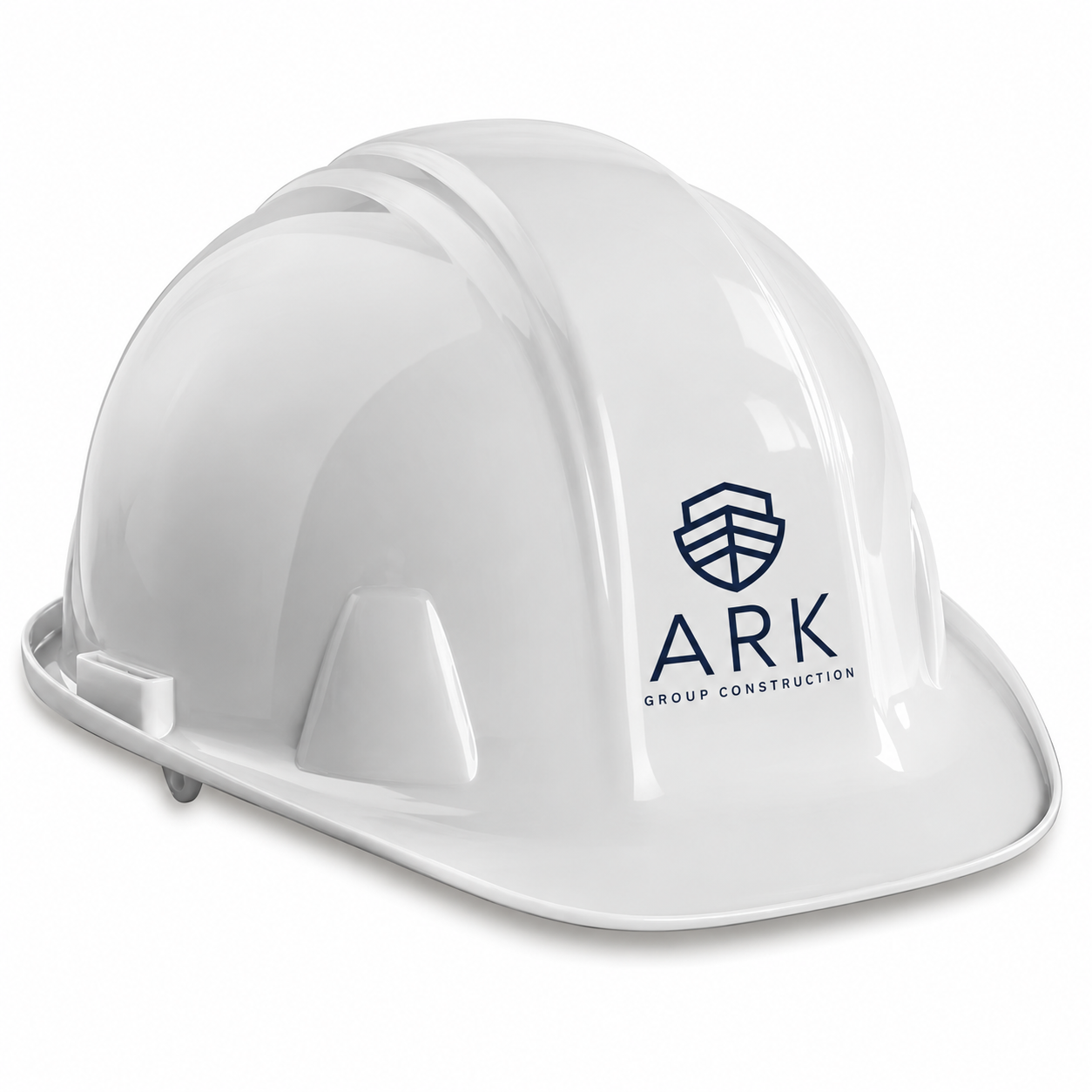
On a hard hat.
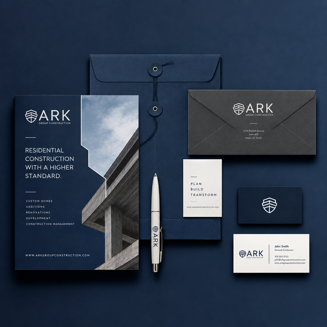
On project documents.
On a property sign.
And on a screen.
We developed the visual system to scale across those environments while maintaining the same sense of clarity and structure.
The result is a flexible identity that feels equally at home on the job site and in the finished spaces ARK builds.
The Photography.
The work itself became an important part of the brand.
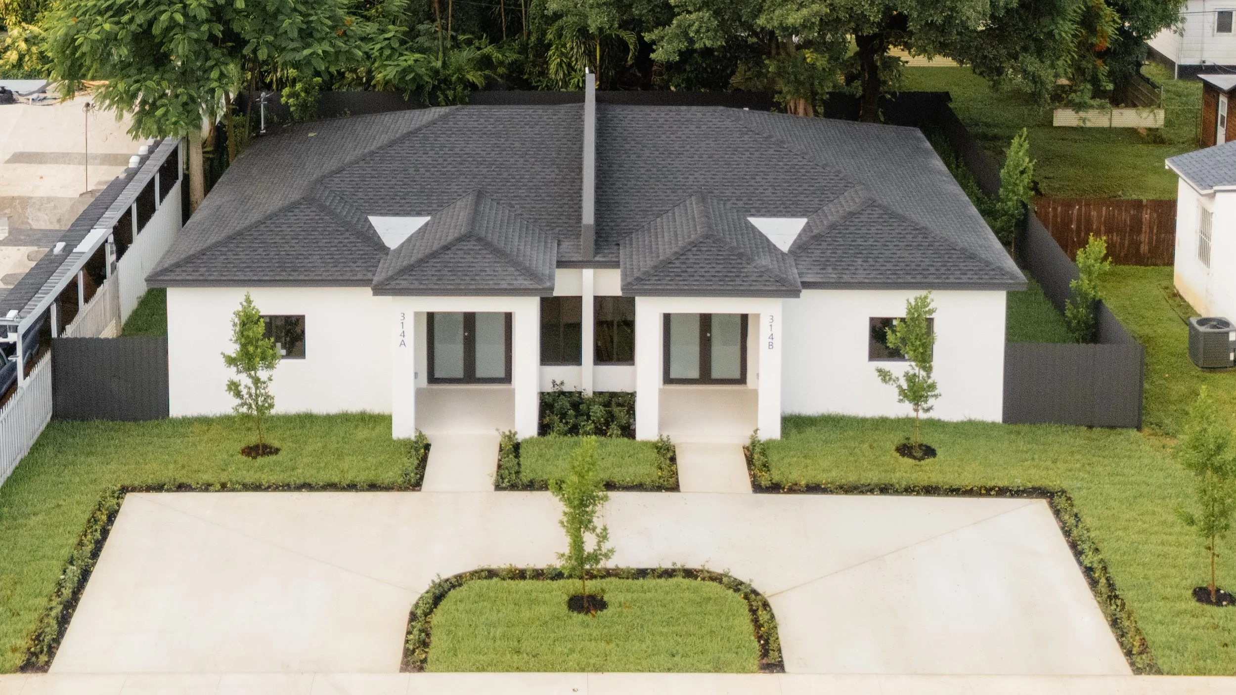
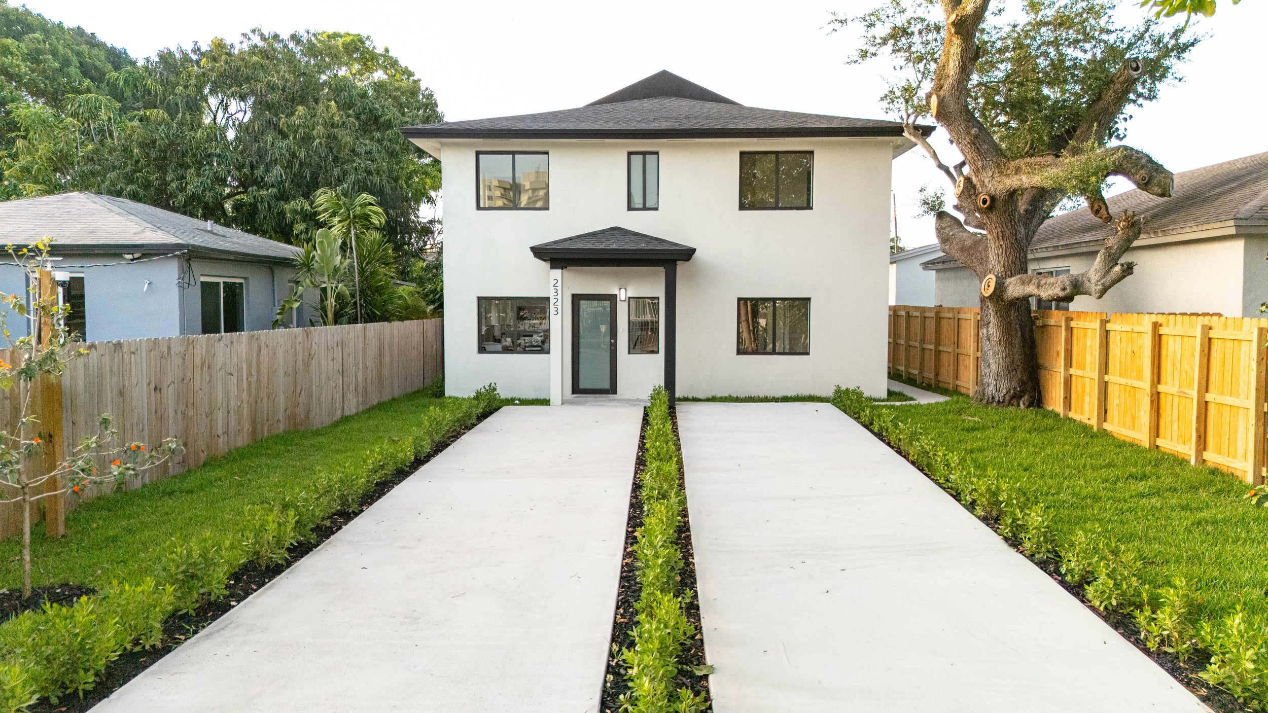
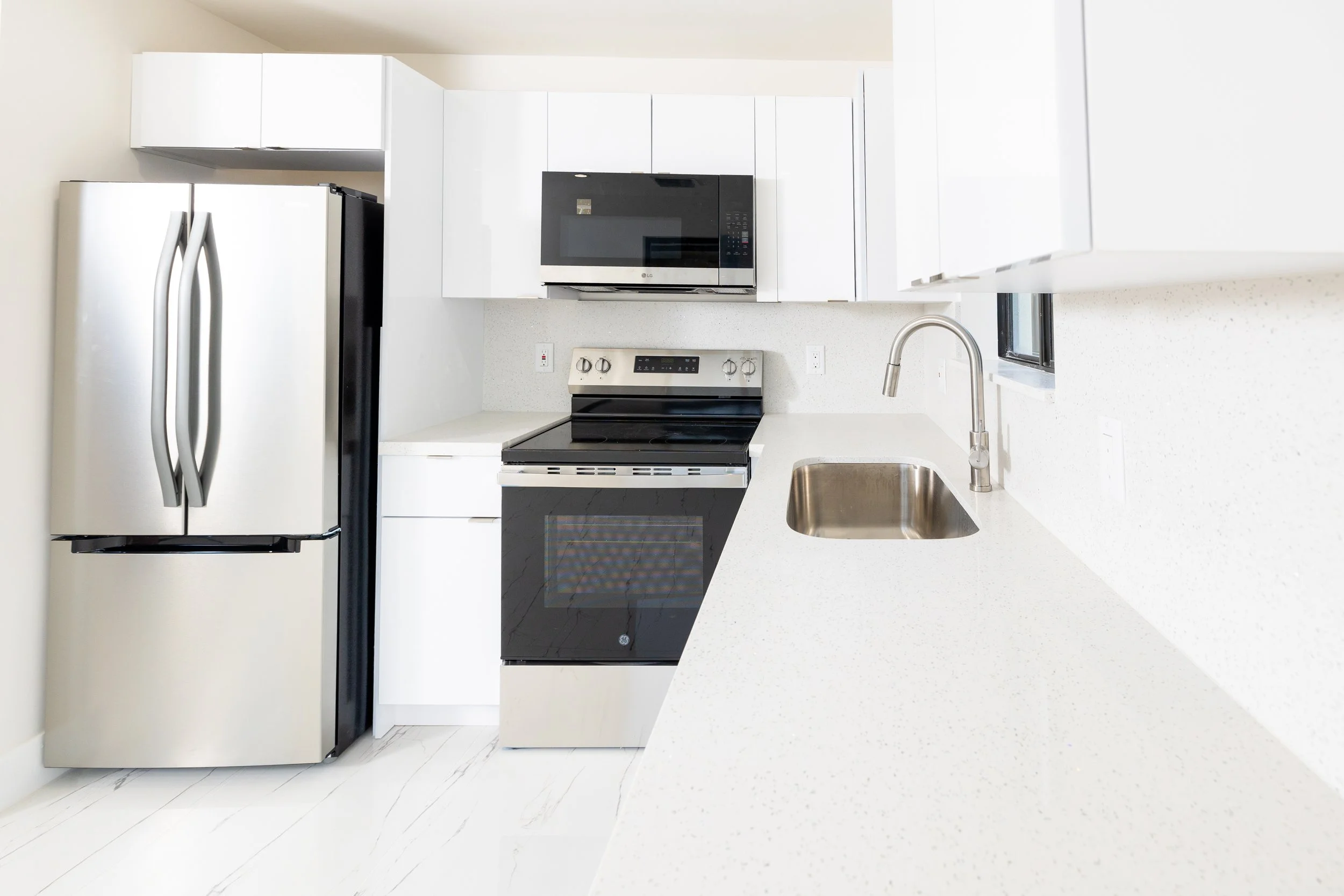
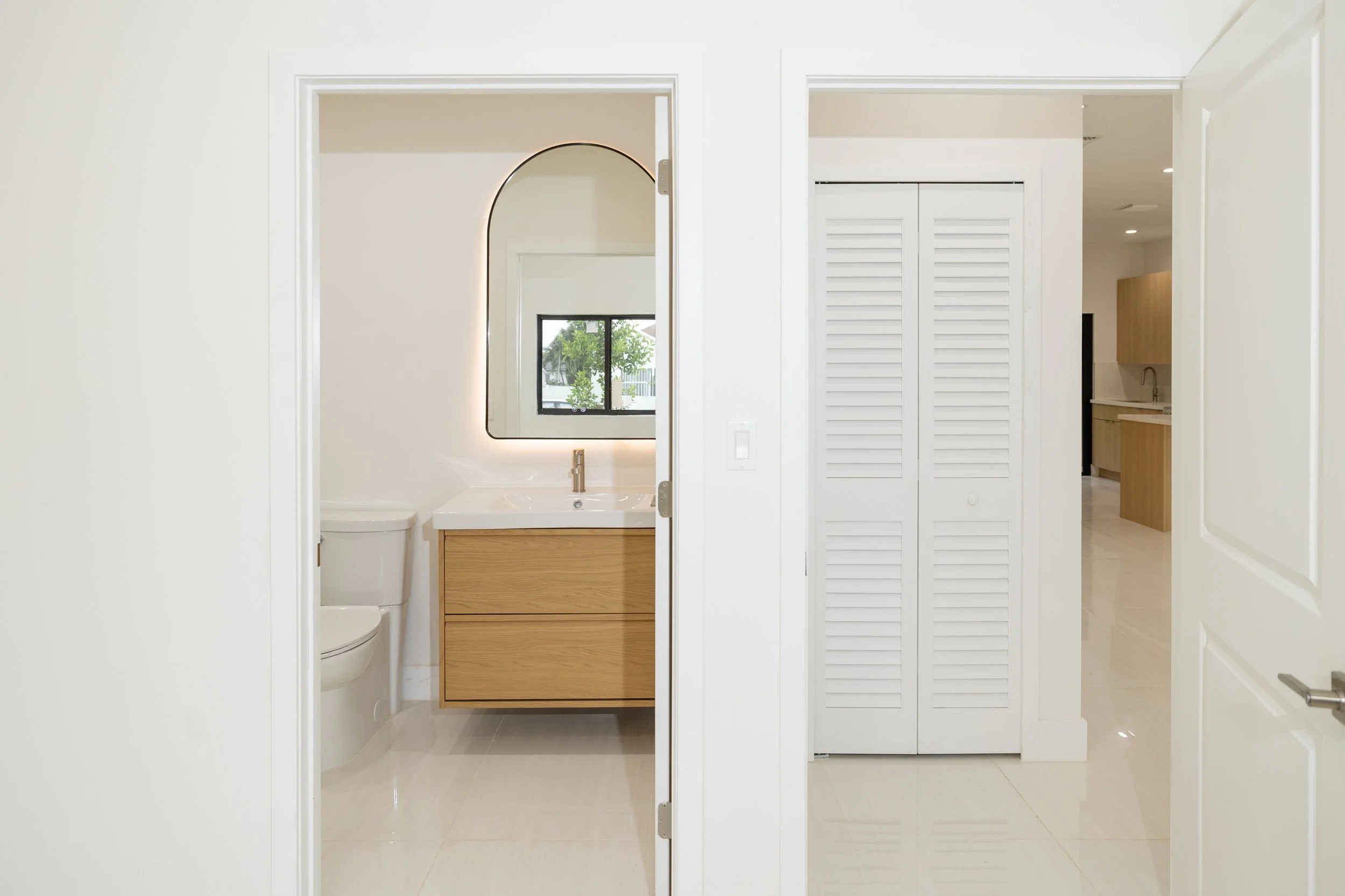
We photographed ARK properties and construction projects to create a visual library that could communicate the quality of the work beyond the identity alone.
Rather than treating construction photography purely as documentation, we approached each property through an architectural lens — capturing the scale of the spaces, the materials, the details, the progress, and the finished environments.
Wide architectural views establish the project.
Closer details reveal the craftsmanship.
And images of the spaces themselves allow the viewer to imagine what exists beyond the construction process.
Together, the photography gives ARK a visual language grounded in the work they actually do.
The Digital Experience.
The website became the place where the entire brand comes together.
ARK’s business is not a single service or a single type of client. The website needed to help someone understand what ARK builds, how the company works, and most importantly, where they are starting from.
We structured the experience around those questions.
Custom homes.
Duplex and multifamily infill.
Home additions.
Permit-ready drawings.
A lot without plans.
Or simply a lot and a question about what is possible.
The result is a digital experience that doesn’t force every client through the same path. Instead, it gives them a clear starting point and guides them toward the process that makes sense for their project.
The Process.
One of the most important parts of ARK’s positioning is transparency.
Instead of hiding construction costs inside one lump-sum number, ARK shows clients the actual cost of the work and keeps its contractor fee fixed from the beginning.
We translated that philosophy into the digital experience through a clear, editorial information hierarchy.
The process is broken down into steps.
The starting points are clearly defined.
The difference between ARK’s cost-plus-fixed-fee model and a traditional lump-sum contract is made visible.
And the language is intentionally direct.
The goal was never to make construction look simpler than it is.
It was to make the complexity understandable.
The Projects.
The finished work became another part of the brand story.
Through photography and the website, ARK’s projects are presented not simply as completed houses, but as evidence of the process behind them.
New construction.
Duplexes.
Additions.
Work in progress.
Finished spaces.
Each project adds another layer to the visual identity, allowing the brand to be experienced through the places it helps create.
The Outcome.
ARK now has a visual identity that reflects the way the company operates: structured, transparent, and intentional.
The brand gives the company a recognizable presence.
The photography gives it a visual point of view.
The website makes its process easier to understand.
And together, they create a cohesive experience across the physical and digital world.
Because for ARK, clarity isn’t just something they say.
It’s how they build.